Layout
Let’s get familiar with the layout of ProcessChampion on Power BI
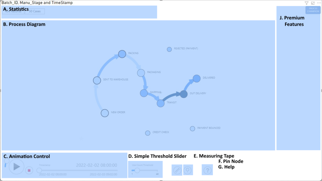
ProcessChampion has multiple regions on the user interface where you can interact and analyse data. The regions include
A. Statistics – Shows the statistics of the Event Log file, including total records count and number of unique cases.
B. Process Diagram – The automatically discovered process map is shown here. The Circle (nodes) describe the Activities and the Lines (edges or links) describe there is at least one pair of events where a Case goes from Activity from to Activity to.
C. Animation Control – This is your main control for data animation, including Speed Control, Play/Pause, Stop and Timestamp
D. Simple Threshold Slider – This slider controls the Use Count Threshold. It visually connects or disconnects the links (Lines on Process Diagram) between activities (circles on Process Diagram). It looks at how many times a link is used, and use the slider to show or hide (lesser used links). This is great for finding activity relationships which are more used than others.
E. Measuring Tape (On/Off, Shortcut Key CTRL) – This allows you to measure average time and utilization across ANY two activities (nodes).
F. Pin Node (On/Off, Shortcut Key SHIFT) – This allows you to move and hold the Nodes in place. This is useful when you want to move the activities around for different views.
G. Help – Takes you to the User Guide section.
J. Premium Features – This contains the menu when Premium features are activated. For this article, we can do everything with the free edition.