Keywords: #ProcessImprovement #ProcessMap #HowTo #ProcessMining
Process Maps are a graphical notation of your process. Using process mining tools, you can automatically discover your processes without the need to model.
Automatically discovered process maps can be a great way to understand how things work in your organisation. It helps in communication and conformance checking. In this article, we will find out how to automatically discover a process map using ProcessChampion.
Before You Begin…
Option 1. Quick Setup
We will use this Power BI Template to describe the steps in this article. You will need Power BI Desktop to use this template.
Option 2. Manual Setup
- Have a Microsoft PowerBI account and Power BI Desktop
- Setup ProcessChampion (Free Edition) or alternatively, use this Power BI Template to follow the contents in this article.
- Use this Sample Data (376Kb).
Let’s go!
Initial Load
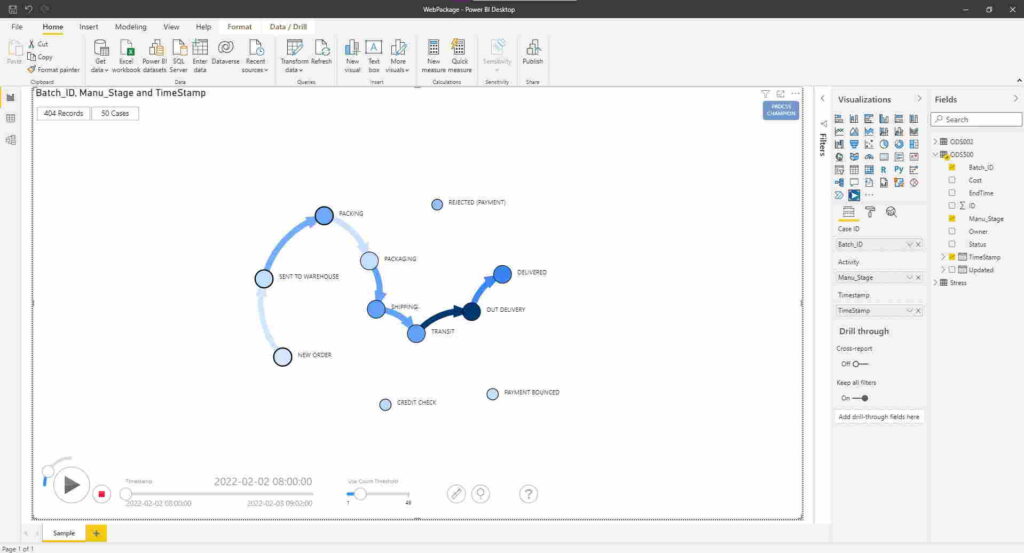
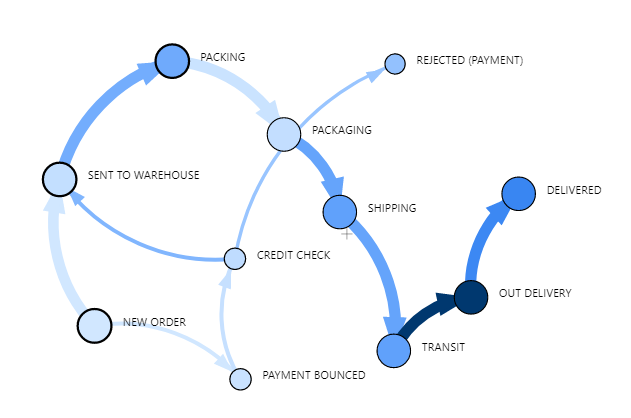
Congratulations. This is the default process map that is automatically discovered for you.
Let us walk through some of the description and tools to help you unpack even more.
Layout
Let’s get familiar with the layout of ProcessChampion on Power BI
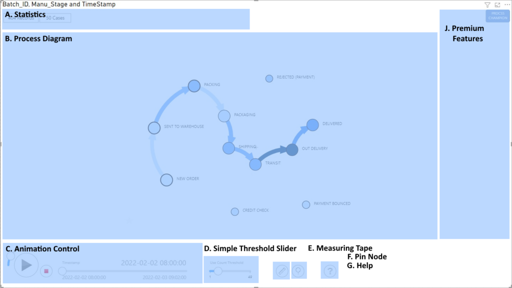
ProcessChampion has multiple regions on the user interface where you can interact and analyse. The regions include
A. Statistics – Shows the statistics of the Event Log file, including total records count and number of unique cases.
B. Process Diagram – The automatically discovered process map is shown here. The Circle (nodes) describe the Activities and the Lines (edge, or links) describe that there is at least one pair of events where a Case goes from Activity from to Activity to.
C. Animation Control – This is your main control for data animation, including Speed Control, Play/Pause, Stop and Timestamp
D. Simple Threshold Slider – This slider controls the Use Count Threshold. It visually connects or disconnects the links (Lines on Process Diagram) between activities (circles on Process Diagram). Basically, it looks at how many times a link is used, and used the slider to show or hide (lesser used links). This is great for finding activity relationships which are more used than others.
E. Measuring Tape (On/Off, Shortcut Key CTRL) – This allows you to measure average time and utilization across ANY two activities (nodes).
F. Pin Node (On/Off, Shortcut Key SHIFT) – This allows you to move and hold the Nodes in place. This is useful when you want to move the activities around for different views.
G. Help – Goes to the User Guide
J. Premium Features – This contains the menu when Premium features are activated. For this article, we can do everything with the free edition.
Reading Process Map
The main visual on ProcessChampion is the Process Diagram. You can see it uses two major graphical notations:
- A circle ◯ known as a node, which describes an activity . It is accompanied by a text label.
- An arrow link → (line between two circle) known as an edge, which describe the relationship between two activities. Note: The direction of the arrow is important, symbolizing a From/To relationship.
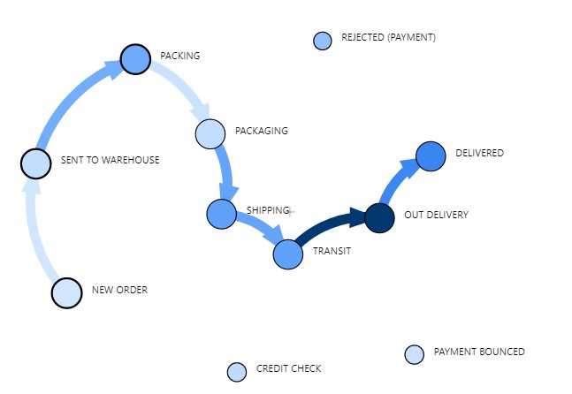
The process diagram is automatically discovered (or mined ⛏️) using the event logs.
Activities (Circle, Nodes)
Activities are illustrated by the circles in the diagram. Using our sample data, we can see that there are a total of 11 unique activities.
- NEW ORDER
- SENT TO WAREHOUSE
- PACKING
- PACKAGING
- SHIPPING
- TRANSIT
- OUT DELIVERY
- DELIVERED
- REJECTED (PAYMENT)
- CREDIT CHECK
- PAYMENT BOUNCED
The total number of circles describing activities are mined directly from the event log. All activities are shown.
Note: For performance and analytical reasons, you may want to introduce a soft cap to the number of unique activities to about 50.
Links (Edge, Arrow)
A link between two activities (e.g. NEW ORDER -> SENT TO WAREHOUSE) describe that there exist at least one occurrence where a case (Entity) goes from activity from, to activity to. The direction of the arrow is important.
Reading Use Count Threshold
Use Count Threshold and Floating Activities
You may notice some floating activities? For example, the activities REJECTED (PAYMENT), CREDIT CHECK and PAYMENT BOUNCED are not joined to any other activities. You might be wondering why?
The floating activities are the result of the Threshold. This is a number which which hides links if the link’s use count fall under this threshold. For example, if the threshold is 20, then any link that is used less than 20 times is not shown.
Why is this important? Adjusting this threshold allows you to view a simplified version of the process.
Note: This is only implying less used links may be less important and not a concrete definition. You as the subject matter expert will be able to make this call.
The threshold is controlled by the Threshold Slider. Try sliding the Use Count Threshold slider to the far left.
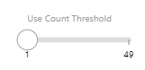
With a very low threshold (sliding to the left), you can see that all the floating activities are now connected to others. Conversely, if you slide the slider to the right, you are imposing a higher threshold which is a stricter rule in terms of what links to show.
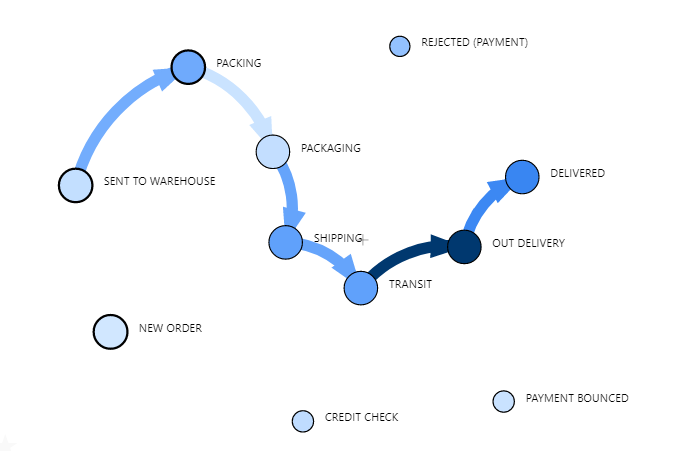
In a ideal world, every event happens according to the process definition. However, in the real world, there will be exceptions, deviations and variants of the same process. This is really useful for removing noise which can be very common in event logs. You can use this slider to investigate an optimum set of events, or sometimes derive a simpler process by omitting less used activities.
Conclusion
Well done! You have successfully used Power BI and ProcessChampion to discover a process map!.